“Your customers are bombarded with more than three thousand commercial messages per day, and unless we are bold in our calls-to-action, we will be ignored.” — Donald Miller, Building a StoryBrand
When it comes to making sales, crafting compelling copy is only half the battle we face as copywriters. The other half lies in getting our readers to take action.
This is where calls-to-action (CTAs) come into play. But many copywriters don’t give CTAs enough attention.
Today, we’ll delve into the significance of CTAs in marketing and how they can boost engagement, conversions, and the overall success of your campaigns. Let’s roll up our sleeves and explore the world of CTAs.
What Is a Call-to-Action?
A call-to-action (CTA) is a marketing term that refers to a prompt or instruction that encourages the reader or viewer to take a specific action.
CTAs are usually presented as a button, link, or statement directing the audience to perform a desired action, such as making a purchase, subscribing to a newsletter, or filling out a form.
Calls-to-action are essential to any marketing strategy because they tell the audience the next step. The CTA is often the final push that encourages the reader to make a move.
Some examples of common calls-to-action are:
- Order now
- Call today
- Schedule an appointment
- Book a consultation
- Buy now
- Get your [free thing]
What Makes a Good CTA?
A CTA should align with the page’s overall marketing message.
For example, if you’re asking someone to purchase your new software program, that is the only CTA that should be on your sales page. Don’t also ask the reader to sign up for your email list.
Your CTA should be easy to understand and should clearly communicate your ask. As Donald Miller says, “If you confuse, you lose.” People aren’t stupid, but they are distracted, busy, and overwhelmed. Make things easy for them by telling them precisely what you want them to do. Sign up here for our fantastic new thing.
A good CTA should also be visually appealing and stand out from the rest of the content on the page. Readers usually skim content; if your CTA button isn’t obvious and eye-catching, people will overlook it. It should be a different color from anything else on the page. Make the button large and use a big, bold font.
Last, a successful CTA should create a sense of urgency and encourage the audience to take action immediately. Get your discount now.
How Often Do You Need to Use a CTA?
In his book Building a StoryBrand, Donald Miller recommends your first call-to-action be in the upper right-hand corner of your website. Then you should repeat the same CTA above the fold, “in the center of your website, and again and again as people scroll down the page.”
Why so frequently?
Human psychology.
We’re wired to seek guidance and direction. We want to know what to do next and how to do it. This is where a good CTA comes in. It provides a clear path for your readers, telling them exactly what action to take.
And it’s nearly impossible to have too many calls-to-action on a page.
Studies show that repetition is a powerful tool for influencing behavior. The more we hear or see something, the more likely we will remember and act on it. Repeating our CTA reinforces our message and increases the likelihood that the reader will do as we ask.
Frequent CTAs are also necessary because people have short attention spans. In today’s fast-paced world, we are bombarded with information from all directions. It’s easy for readers to get distracted and lose focus. Repeated CTAs remind readers to take action.
Want to hear a fun fact? Business Made Simple University (by Donald Miller, author of Building a StoryBrand) has 12 CTA buttons on the homepage.
Where Can You Include CTAs?
CTAs aren’t just for sales pages. Copywriters can use CTAs in various places to guide their audience toward a desired action.
One common place to use CTAs is in email marketing campaigns. Including a compelling call-to-action in your emails encourages readers to click through to a landing page or other content.
CTAs can also be used in blog posts to encourage readers to engage with the content. For example, a call-to-action at the end of a blog post might ask readers to leave a comment or share the post on social media. This CTA increases engagement and encourages your readers to spread the word to a broader audience.
Another place to use CTAs is on the homepage of your client’s website. You might ask readers to download a freebie in exchange for their email address so your client can stay in touch and build an email relationship with them.
Social media is another platform where CTAs can be effective. Including a CTA in a social media post can encourage followers to click through to a website, sign up for a webinar, or buy a product. These CTAs can be particularly effective when promoting a new product or service.
Even in offline marketing materials, such as brochures or flyers, CTAs encourage readers to take action. For example, a brochure for a gym could include a call-to-action encouraging readers to sign up for a free trial or schedule a tour of the facility.
Examples of Effective CTAs
Airbnb

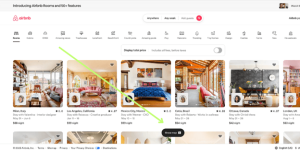
The call-to-action on the Airbnb homepage is crystal-clear. If site visitors want to see a map, they should click that button. And because the button is fixed, it stays visible at the bottom of the screen even as visitors scroll the page.
AWAI

Look at the CTA on the AWAI homepage. The large CTA button is the only orange on the page, so it really pops. Visitors new to AWAI know exactly where to start.
Business Made Simple University

BMSU uses a brand-matching blue for their CTA button, but with an ombre effect, so it stands out against the background. The CTA “Get Access” tells readers that they’ll get access to the course when they click the button.
Final Thoughts on CTAs
CTAs are essential to our marketing strategies because they guide our audiences toward a desired action, leading to higher engagement and conversions. It’s worth your time to make sure you get your CTAs right.
What’s an effective call-to-action you’ve seen or used? Please share it in the comments below.