Your banner image is the picture people see before anything else the moment they land on your LinkedIn profile. It’s the really big banner photo right above your profile picture. I’ve seen a few great LinkedIn banner images and a few not-so-good ones (sorry, random picture of sunset!).
The thing that differentiates both categories is uniformity. If your banner image tells one story, but your entire profile is about something else, you’re wasting important real estate here.
The LinkedIn banner photo or cover photo can be a means to build more credibility, boost conversions, and effectively brand yourself or your business.
The Basics
- In the banner image, convey your brand and the focus of your marketing right now and contact details or call-to-action. Make it professional and use a standout design. I use Canva to design and update my banners for LinkedIn. Canva has a host of template options for you to choose from and minimize the amount of time and effort you need to do this.
- Make this a monthly thing — a part of your marketing strategy to check your banner image and ask yourself if it aligns with your business and marketing right now. Update it if it doesn’t.
- Review your cover image on both mobile and desktop devices to ensure it is clearly visible and no important information is hidden behind your profile picture.
Now, let’s look at a few different ways to set up a cover image on LinkedIn.
When You Have Tiered Offers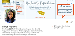
If you have a free downloadable guide, a course, as well as premium services, this design can carry it all. Currently, I have a free e-book downloadable (notice how I’ve added 250+ downloads on the top side of my e-book for credibility and trust-building), a course, and VIP services.
No one visiting my profile would be interested in all three, so I’m not breaking a rule by mentioning multiple offers. Be sure that everything you mention on your cover image is tiered — so as not to confuse visitors into inaction.
I also mention that the links to download the free guide and buy the course are in the Featured section. So visitors know where they can find them.
And, for anyone to learn more about the VIP 1:1 services, they will need to DM me.
Calls-to-action are important here for profile viewers to know what to do next if they’re interested.
You may be newer and not have this level of offerings, so your design might be simpler, but the takeaway should be that if you have something to offer prospects, make sure they see it by putting it in your image and make sure they know where to find your offerings.
When You’re a Copywriter with Social Proof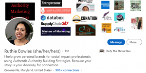
If you’re a copywriter wanting to build credibility and trust with your LinkedIn banner, include what brands you’ve worked with so far, just like Ruthie does.
This is especially effective if you’ve worked with big names and recognizable global brands. But even if not, having logos of businesses up there is proof that businesses have used and liked what you do.
Here’s a side note to hit home the idea of information placement on your banner image. Notice how Ruthie’s profile image hides a part of her banner image. Now a simple shifting of the text a little bit higher on the banner image can prevent this from happening and will give the overall landscape a clean look. So make sure nothing important hides behind the profile picture.
When You’ve Got a Podcast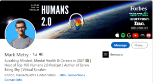
If you have a podcast, your banner image can have social proof, the logo of your podcast brand, and places where people can tune in. You can also include a picture of you in front of a mic recording a podcast and your contact details.
Having a picture of you recording or talking can help with personal brand building and make you more credible.
When You’ve Got a Book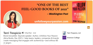
If you are a published author, your banner image can have a snapshot of your book along with the details where people can find it and your contact details, just like Terri Trespicio has here.
I’d also recommend you link your book’s landing page or purchase link in the Featured section of your profile for easy access to it.
When You’ve Got Content Services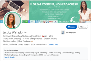
If you are a copywriter or content writer with stellar services, market them directly on your banner image. Your banner image then becomes an introduction or a pitch of your services, along with some social proof for credibility and trust-building.
Don’t forget to slide a call-to-action in there, too.
Design Your Banner Image
So think —
What’s the focus of your marketing right now?
What do you want your ideal clients to know about you when they land on your profile?
What do you want them to do?
Your cover image is important real estate you can use to market your most important assets or services, showcase your credibility, and earn new clients.