 On April 21, 2015, Google launched a new algorithm update commonly referred to as “Mobilegeddon.” The intent of this algorithm is to improve user experience for searches on mobile devices, primarily smartphones. To do this, Google focuses on presenting only mobile-friendly pages in their search results. So, if your pages aren’t mobile-friendly yet, you can kiss some traffic goodbye until you get this fixed.
While this is extremely inconvenient to website owners, it’s a good move on Google’s part. Mobile searches are becoming more and more popular. In fact, Google confirmed that in the U.S., 94% of people with smartphones use them to search the Web.
Google conducted a study with over 1,000 mobile Internet users in the U.S. and learned:
- 61% will leave a mobile-unfriendly site right away
- 67% are more likely to make a purchase on a mobile-friendly site
- 74% are more likely to return if they have a great mobile experience
Have you ever used your smartphone to surf the Web? If you have, then I’m sure you’ve noticed when the content is difficult to read, images are hard to see, and navigation buttons are too small to tap on. As a result, you have to pinch, pull, or drag the page to get the information you want. This is really frustrating, isn’t it?
Google wants to prevent such frustrating experiences. They want mobile users to land on pages that are user-friendly and relevant. So, if your page isn’t mobile-friendly, they’ll send the searcher to another site ― aka, your competition’s. This reduces traffic to your site and limits your potential to build your list, nurture relationships, or make a sale.
So, having a mobile-friendly site is important for a lot of reasons. Do you know how your site fares under Mobilegeddon?
Identify Current Mobile-Friendly Status
Before you do anything, you’ll need to determine your current status. The easiest way to do this is to go to SEMRush.com. On their home page, enter your web address in the search bar and click “Search.” This will take you to an overview section. The initial results will show you stats for desktops. To see your mobile results, simply click on “Mobile.” The results will show you a ratio of pages that are mobile-friendly to those that aren’t.
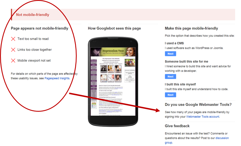
You can also go to Google and conduct a mobile friendly test. Enter the domain address of a page you want to test and Google will tell you if it’s optimized for mobile users or not. If not, go to your Webmaster Tools account (lower right-hand column) and you can get all the gory details.

Determine Level of Urgency
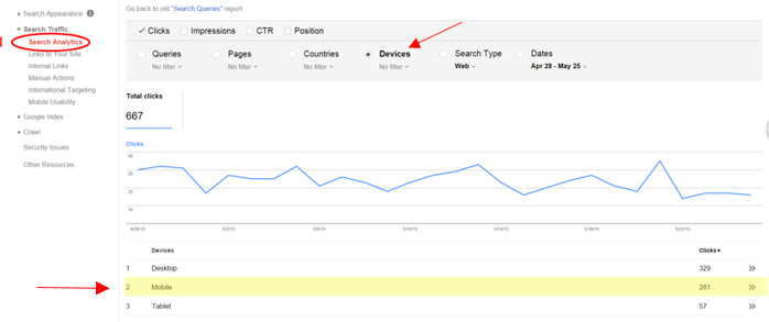
To determine how urgent the issue is, you should check to see how users are finding you. Are most of them desktop or mobile users? To check this out, in your Webmaster Tools account, go to Search Traffic -> Search Analytics. Choose the “Devices” radio button. This will show you the number of clicks you get on desktops, mobile devices, and tablets. You can see on the screen shot below that 42% of my searches are happening on a mobile device. I don’t want to lose almost half of my traffic, so getting mobile-friendly is urgent and should be a top priority.

Prioritize Pages to Optimize
I have over 200 pages on my site. So, how do I prioritize which pages I optimize first? Simply select the radio button for “Pages” (instead of “Devices”) and you’ll get a list of pages in descending order by number of clicks.
Notice that you can also change the date range. I recommend you look at the last 90 days or longer to make the analytics more statistically relevant.
So, what criteria are being used to determine if a site is mobile-friendly? There are five primary factors that we’ll review below. A word of caution, some of it is a bit technical, but good information to have just the same.
5 Mobile Usability Factors
- Type of Animation
Animation has typically been done using Flash. Unfortunately, smartphones can’t load animation or content that uses Flash. If you are using Flash animation on your site, you’ll need to convert it using updated web technology such as CSS or JavaScript.
- Page Dimension and Scaling
So many different devices are being used now to search the Internet. As a result, your page layout can’t be fixed. Instead, it needs to adjust based on the browser and device being used to view it. To ensure this happens, you’ll need to use a responsive web design.
Also, all pages having a responsive design must include a meta viewport tag in the head section of the page. This tag basically tells the browser what page dimensions and scaling to use. The tag would look something like this:
<meta name=viewport content=”width=device-width, initial-scale=1”>
- Content Scaling
Similar to page layout, the content needs to be adjusted to meet requirements of the device. If your content is coded using absolute values, or your images are at a fixed width, you’re going to have issues. To solve this problem, make sure you use CSS elements that allow for relative width and positioning. This will allow the content and images to scale as needed, depending on the device.
- Font Size
If your font size is too small, it will be difficult to read without having to squeeze, pinch, zoom, or swipe. As a result, you need to use legible, scalable font sizes. To do this, you will need the responsive web design and viewport tag in your headers.
Once this is done, you can define a baseline font size of 16 CSS pixels and line height of 1.2em. Then set a typographical scale relative to the baseline. For example, “small” might be 75% of baseline and “large” might be 125% of baseline.
One word of caution, don’t go too crazy with fonts and scaling, because it will complicate your page layouts ― which will defeat the whole purpose.
- Navigation Buttons and Other Touch Elements
If your links or navigation buttons are too close to each other, visitors will have a hard time navigating your site on a touchscreen. Your links and buttons need to be large enough, and far enough apart, that an average adult-sized finger can tap it easily. Users should not have to expand the screen in order to access a touch element.
The frequently used elements, such as navigation buttons, should be 48 CSS pixels tall/wide. Less used elements can be smaller. However, make sure you include extra spacing around them.
There you have it! Everything you wanted to know about “Mobilegeddon” but were afraid to ask! While it seems like a lot of work, and it might be, depending on what platform you’re using, it will be well worth it in the long-run.
Having a mobile-friendly site is imperative if you want to compete online, continue to develop relationships with your customers, and build your brand.
Editor’s Note: For more on this topic, see Jim Wright’s article Surviving Mobilgeddon on the Wealthy Web Writer.